“Thinking outside the box,” I could be referring to any of many boxes that we get ourselves stuck in. As you know, there are lots of bias effects that can influence our problem-solving (or research) skills. We’ve talked about some of them before: confirmation bias (finding information that confirms one’s beliefs while giving less attention to information that contradicts it), the availability heuristic (counting on immediate examples that come to mind when considering a specific topic), and functional fixedness (using something only in the way in which is typically described or thought-about).
There is an important variation on these biases. Let’s call it the common reference effect. It is the tendency for people to look first (and often, only) at the reference material that they commonly use. It’s a little like the availability heuristic in that it’s an effect of “using what you already know about,” but it’s a bit more than that.
The common reference effect is when people tend to use the same reference materials repeatedly, even when it’s more difficult to use or less-complete than another source.
Our Challenge questions for this week are:
1. Can you create a chart showing the difference in the populations between North and South Korea since 1970? (Just a simple line graph would be fine, thanks.)
2. Can you compute the market cap, total revenue, and number of outstanding shares for each of the companies IBM, Apple, Google, and Xerox?
3. Having recently dived in the Caribbean, I’m really interested in whale sharks. Can you quickly compare blue whales, gray whales, sperm whales, and whale sharks in terms of (a) lifespan, (b) maximum length, (c) weight? (Just the facts, ma’am.)
As several readers pointed out, yes, you can search on Google for these questions. For instance, for the Koreas population question the simple query of [ population South Korea ] will give you a lovely chart that also includes North Korea.
The second chart is especially useful because it gives the date of last update to the data (July 27, 2015) and the source (World Bank), and you can do various analyses with the data (e.g., compare to other countries or data sets).
But it doesn’t quite give you the difference between the two populations.
Likewise, it’s straightforward to use Google to get to the financial data for each of those companies. Just do a query for the NASDAQ stock ticker name, and you’ll get something like this:
A few more searches will get you the rest of the data (market cap, etc.).
And naturally, if you do a search on Google for [ blue whale ] you’ll get a bunch of great results, and a nice Knowledge Panel in the upper left telling you more about this particular whale (e.g., the largest animal to have ever lived–bigger than the biggest dinosaurs).
And while you can do SOME side-by-side comparisons on Google, you can’t do arbitrary comparisons. Here’s one you can do:
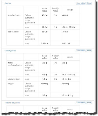
HOWEVER… it’s not possible (currently) to compare any two arbitrary items side-by-side on Google, even when they’re similar kinds of things. (For instance, you can compare [ avocado vs. salsa ] but, oddly, not [ guacamole vs. salsa ] which you might think you could.)
But as several regular SRS readers noted, the Wolfram Alpha search engine can do this fairly easily.
In general, as SRS-ers, we want to be aware of what tools exist, and what their special and unique capabilities are. And one of the things that Alpha does quite well is side-by-side comparisons.
So if we do that same [ guacamole vs. salsa ] query on Alpha, we see a useful comparison:
In any case, from a SearchResearch perspective, this is the kind of tool we need to find these tables of comparisons. Alpha does a pretty good job here.
Korea population:
Notice how I framed the query here–as a math expression. Alpha does a great job converting arbitrary inputs into mathematically meaningful expressions.
Notice in particular the chart is the DIFFERENCE between the two countries, and shows the change over time.
An issue here is figuring out where the data actually comes from. If you scroll to the bottom, you can click on the Sources link, which brings up a particularly unhelpful list, including that the “Primary Source” is Wolfram|Alpha Knowledgebase, 2015. That’s a bit like saying “Because I said so…”
There is a pretty generic list below that of sources that the Knowledgebase draws upon, but it’s pretty vague.
(Apparently you can send them a message and ask for details, but I haven’t tried that yet.)
Financials: How would you do something like this analysis in Alpha?
Just copying the string of company names into Alpha gives you this…
Again, read the fine print carefully. See that “Assuming GOOGL”? (Pointed to by the red arrow.) Be aware that when things like that show up (or in the Google results way above), they can be important. Google stock is now listed under TWO stickers: GOOG and GOOGL. To get an accurate picture, you need to consider both… notice where the values are the same, and where they differ.
Sea Creature Comparison: Now we know that Alpha is good on demographics and financials–what about biology? Do a similar kind of search…
As you see, the side-by-side comparison tables are fairly interesting, and certain cover the lifespan, length, and weight we were interested in.
The aspects of the tables can be somewhat random (e.g., “length of whole intestine”), but the capability of automatically generating side-by-side comparisons of different kinds of things can prove incredibly useful.
For instance, suppose you’ve been reading about VW cars recently (just, hypothetically) and you’d like to get a quick sense of how two different VW cars differ. Here’s an example:
Search Lessons:
Tools: As always, know your tools. Among its many capabilities, Alpha is GREAT about generating tables of side-by-sides comparing and contrasting different kinds of items.
Verify: On the other hand, verify-verify-verify. If your task is critical, then you’ll want to double-check the actual values presented in the tables. (But that’s true for all search engines…)
Check the details: And always read the fine print. I’ve seen lots of searchers get tripped up by doing a search and landing on a chart or graph that seems at first blush to confirm what they’re looking for. CAUTION! It’s easy to find things that confirm your bias and your expectations. Whenever you find a chart / data, look for the source, and check all of the tiny print around the outside. Be sure you know what assumptions are baked into the analysis. (For instance, how much of guacamole is being considered in the analysis? A factor of 2 can be deeply important for your next Mexican-themed party!)
Common Reference Effect: Don’t get trapped by the common reference effect. Great researchers know multiple ways to find information, and know what the strengths (and weaknesses) are of all of their data sources and tools.
This was a fun Challenge! Thanks to everyone for their contributions!
NOTE: This week’s Challenge will come out tomorrow, on Tuesday rather than Wednesday. (I’m traveling for much of this week, so I need to push it out tomorrow. Happy searching.)


