… the second part of last week’s Challenge was:
2. (Harder) Can you find the top 100 LA City Council headlines on guns, and then extract the publication dates to create a week-by-week histogram of when these articles were published? (This is a two-step challenge: (a) find and extract the dates, (b) put the dates into a spreadsheet and create a histogram showing the number of publications on this topic by week.)
To solve a Challenge like this (which looks a little like something a data journalist might do), it’s really useful to work backwards from the goal.
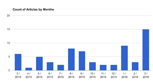
Here we want the histogram–one that looks like this (I’m doing this by months rather than weeks to make it simpler to read):
Each bar shows the number of headlines published on the topic of LA City Council and guns, by month from March 2015 – March 2016.
That’s what we want to create. Now, how we get from a SERP full of headlines (see below) to the histogram above?
This is what the SERP from our search looks like:
Here’s the plan:
1. Find all the articles published on our topic in our time period (3/15 – 3/16).
2. Extract the text from the SERP and put into a text file.
3. Extract the publication dates from each of the headlines, put those into another file.
4. Clean the data (to get rid of any errors).
5. Sort the dates and make the histogram.
(Told you it was slightly harder than the average Challenge.)
Let’s work through this each step at a time:
1. Find the articles
Good news. We’ve already done that. You just use the Advanced Search features in Google News. But how to get all of the top 100 results?
Remember than you can use the Search Settings to change the number of results displayed on your SERP. Note that you have to turn off “Instant predictions” results in order to show all 100 at the maximum number of results per page.
2. Extract the text from the SERP and put into a text file.
Now, once you have all 100 results shown on the page, you can simply select all 100 results, copy (Control-C or CMD-C), and then paste into your favorite text editor. (Paste as “text-only,” you don’t want the images or the HTML in there.)
As this point, you should have a text file that looks like this:
3. Extract the publication dates from each of the headlines, put those into another file.
As you can see, each of the dates in the text file represents exactly one article that’s on our topic. Since we’re trying to count the number of articles by week (or by month), all we need to do is to pull out each of the dates in this file and put them a spreadsheet for making the histogram.
Since this is a smallish data set, you could just do it by hand. But what if we were going to analyze thousands of dates over many years? How would we pull the dates then?
There are a couple of options:
(a) Write a small program to go line-by-line through the text, finding the dates, and writing them out to another data file.
(b) Use a text editor that has a regular-expression pattern matcher built into them. (I sometimes use TextWrangler in this way.) You can do a search for the year, and extract all of the lines that have a date in them.
(c) Use built-in Linux commands to extract the lines with dates. As I’ve mentioned before, the Linux command grep is used to pull out lines from a text file that match a regular expression pattern.
I opened a Terminal on my Mac, did the following grep:
grep 20dd results.txt > dates-file.txt
the magic here was in the 20dd — that’s the pattern I wanted to match. 20dd will match any 2 digits preceded by a 20 (e.g., 2014 or 2015). The input file is results.txt and the output file is dates-file.txt
The rest of that line says to do the matching on the results.txt file (where I put all of the text from SERP) and put the results into dates-file.txt
You can see that each line of text ends with a date. That’s handy because now I want to…
3. Extract the publication dates from each of the headlines, put those into another file.
Again, there are a number of ways to do this. If you’re a spreadsheet jockey, you can pull this into your favorite spreadsheet and then extract out the dates from each line.
Since I know Linux command lines, I did something really fast and used the awk command. (That link to awk is a pretty good tutorial on how to use it.) Basically awk lets you change a pattern that’s matched in each line; it’s an incredibly handy tool to know if you do much of this kind of data transformation.
awk ‘{ print $(NF-2) ” ” $(NF-1) ” ” $NF }’ dates-file.txt > results2.txt
This looks complicated, but it’s really not bad. Let’s break it down:
awk ‘mini-program‘ input-file > output-file
All I’m doing is running the ‘mini-program‘on the input-file and sending it to a new output-file.
The mini-program is also simple once you look into it. It’s just a print statement with list of things to print. The variable $NF means the “last item in the line of text.” Then the variable before that is $(NF-1), which means “the item BEFORE the last item in the line of text.” And $(NF-2) means, of course, the “one before that…” The other things in there are just spaces to put inbetween the items on output.
Make sense?
So NOW we’ve got a file that’s just the dates from the SERP. (And maybe a bit more…) Before we create our histogram, we need to go through the data and…
4. Clean the data (to get rid of any errors).
Since this is such a small set of numbers, we can just look at it in our text editor and fix up whatever strange things might have slipped through. Easy.
And now we’re ready to do the last step:
5. Sort the dates and make the histogram.


