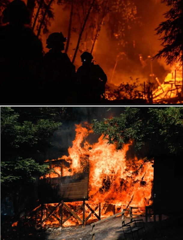
Since our last post, the situation has gotten worse…
When I originally posted this SRS Challenge, the fire map for the Bay area looked like this:
 |
| Aug 26, 2020 |
Now, it looks like this:
 |
| Sep 7, 2020 |
While it’s easy to get the news about the fires, and easy to find information about the CURRENT extent of the fires, it’s a little harder to find a kind of time-lapse of fire growth over the past several days.
How did fire map 1 turn into fire map 2? That’s what I want to see–the change over time of the fire outlines.
(Reminder: current fire map from ARCGIS)
But it’s not trivial to find such an animated map. Can you help me with this week’s SRS Challenge and locate one for us?
1. Can you find a time-lapse map of the growth of the current fires in the San Francisco Bay Area? (Roughly, the area shown in the map above.) Ideally, the animated map should go back to around August 16, 2020, the date the CZU Lightning Fire Complex was started by a sudden flurry of lightning strikes.
This turns out to be harder than I thought. I naively assumed that such a time-lapse photo would be fairly straightforward.
As usual, our Regular Readers came up with some impressive finds.
Mike searched for [CZU fire animation ] (recall that “CZU” is the name of the fire complex near me (and near Mike). That led to this animation of Central California from Aug 15 – 25.
 |
| Single frame from GIF showing fire spread. |
While you can see that this GIF is derived from some data source, but no attribution is given. By squinting hard enough, you can make out the watermark in the upper left and identify the source as NASA’s FIRMS (Fire Information Resource Management System). By searching for that [ NASA FIRMS fire ] you’ll find their remarkable website: NASA Worldview. At that site, you can create these GIFs for a given time span and location on Earth. Here’s a GIF I made for the SF Bay Area from Aug 23 – Sep 7, 2020. You can see the fires when they’re active (marked in orange dots), and the smoke plumes.
 |
| Animated GIF from NASA Worldview. Not quite a map, but showing where the fires are. |
That’s good, but can we do better?
Ramón used variations on queries like [California fires 2020 map timelapse] to find a few more maps that are nice, but show the current state of the fire. Example: The SF Chronicle’s fire map of the state. (Interestingly, it’s the same as the LATimes fire map. Hmm…) Even Google’s fire map is fairly disappointing as it shows only current fires, no time lapse (and, frankly, is missing a few fires).
But here’s the Times/Chronicle map, which shows how bad the situation is at the moment (Sep 8, 2020):
 |
| P/C LA Times |
And a closeup, which shows the Creek fire (the large blob in the center-right):
By using a query like [ California animated fire map ], Ramón found the remarkable YouTube video, California wildfires: 1910-2019 by the geo-mapping company ESRI. This is well worth watching for the historic context of wildfire in our state.
These are nice pieces of work, but not quite what I was looking for. I want to see how the local fires started, grew, and built-up over time. How can we do that?
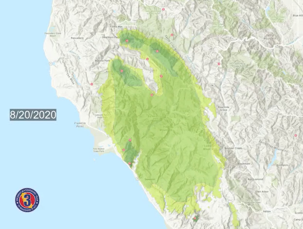
Jon managed to find a useful Tweet from CALFIRE and learned that the kind of maps we’re looking for are called progression maps, which led him to find this animated map on Twitter. This is pretty good, and almost exactly what I’m looking for!
(I can read that this map is from “Incident Management Team 3” but I can’t find the source. Does anyone know what the source is?)
The big winner of the week was Terry, who started with [California fire map multi-day] and other variations on the last term (including “tracker” which seems to equate to “real-time” in practice). Terry looked at the local news coverage on the SF Chronicle site where she found this page, which was really what I had in mind when I posed the Challenge–it shows the fires, their perimeters, and lets you drag the time slider back and forth to see exactly what you need to see. This is an interactive progression map, although they don’t call it that on the page. Interestingly, Terry ran across this page by accident (and doesn’t now remember exactly how). Interestingly,
 |
| A view of the fires over time from the SF Chronicle. |
From this interactive visualization I extracted a few key dates in the fires burning nearest to my home:
While I was writing this post, I spent (too much!) time with the FIRMS data set and found that it’s pretty simple to create a time-lapse video of a region of the world and then download it to your computer. (Use Worldview Snapshots.)
I made a video segment showing the relevant part of California over several days (Sep 6-9, 2020). Here’s the YouTube version of it. Note that you can pause the video, then advance it manually by clicking judiciously on the scrubber bar to go from hour-to-hour, day-to-day.
Or, if you’d like, you can download the original Quicktime MOV format here. If you watch it using Quicktime from your desktop, it’s much easier to browse back-and-forth, hour-by-hour, to get a sense of the drama of California wildfires.
Search Lessons
This wasn’t a straightforward task. Here are a few lessons I take away from this Challenge.
1. Finding the right terminology wasn’t easy. We learned about progression maps and perimeter maps. Both are better ways to describe what I was looking for than just “time lapse” or “animated.” Those terms don’t hurt, but if you can find the precise language, so much the better.
2. Looking for the original source is almost always a great idea. In a couple of cases, we found examples of maps we wanted (often as animated GIFs), but looking for the original source almost always revealed more information (in different formats, with more precise time and location) that we wanted. Track backwards! (It should an instinct in all Regular SRSers!)
3. Keep track of what you find. As Terry pointed out in her comment, she stumbled across the interactive wildfire progressive map viewer, and then had to go back through her search history to re-find it. I have to admit that I never saw this page when doing MY searching. But her experience points out the value of remembering that you can search through your own search history by visiting google.com/history — browse through THAT if you want to re-find something that, in retrospect, seems about right. I try to keep pretty good notes when I’m searching, and I usually leave the tab of a good page open until I’m all done with my research!
Hope you found this an entertaining search! We’re still living with orange skies and flakes of ash falling down all over outside. Hope it’s calmer where you are.
Search on!


